Primo User Experience: A Brief Review (with Takeaways)
By the LSP Discovery/UX Work Group
The LSP Discovery/UX Work Group looked at a number of Primo user experience studies, and pulled out some common themes. Here, we summarize each theme, offer takeaways to consider, and then link to the relevant studies for further exploration.
Students rarely use scopes
Scopes have been tested across multiple institutions, and the findings all point to a similar conclusion. Most students don’t notice the scopes, and even when they do notice them, they don’t choose to use them.
Takeaways: Instead of focusing your efforts on scopes, think more closely about your left-hand facets. If, on the other hand, you want your students to use scopes, you will need to emphasize this as part of your library instruction.
- CSU Task Force: UX Best Practices
- Chico State: Chico UX
- Monash University Library: What Do Primo Users Want?
Facets need to be functional
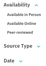
expanded and minimized views
While most students use facets, they sometimes struggle with locating the facets that are relevant. A few facets appear to be used most often: Scholarly journals, date, full text online, and resource type. Also, expanded facets tend to get used more than minimized ones.
Takeaways: Place most useful facets at the top of the list. Use clear facet labels. Reduce information overload by removing unneeded facets. And, be sure to expand only the facets that matter most to students.
- CSU Task Force: UX Best Practices
- CSU Monterey Bay: A/B Testing
- Monash University Library: What Do Primo Users Want?
- Linfield College: Improving Primo usability and teachability with help from the users
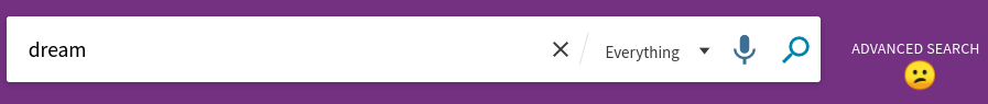
Basic search is preferred
The vast majority of students use the basic search screen, as opposed to the advanced search.
Takeaway: Don’t spend an inordinate amount of time developing a rock-star advanced search page.
- Monash University Library: What Do Primo Users Want?
Students don’t use sorting
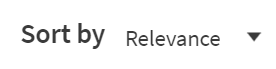
Yes, you can change the sorting order of search results (e.g., relevance, date), but most users don’t.
Takeaway: Spend some time adjusting Primo’s rankings (Alma > Discovery > Ranking Configuration).
- Monash University Library: What Do Primo Users Want?
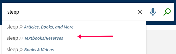
Library lingo is still meaningless
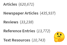
Primo format types
It’s the age-old problem: Library speak! Students don’t understand what “course reserves,” “reference,” “collections,” or “databases” mean. They have a hard time distinguishing between “articles” and “newspaper articles,” and between “reviews” and “peer-reviewed.”
Takeaway: Avoid library jargon - use simple language (for example, “textbooks” instead of “reserves”). Your students will find what they need in less time!
- Chico State: Chico UX
- CSU Monterey Bay: A/B Testing
- Washington State: Usability (LITA)
Format labels are too small
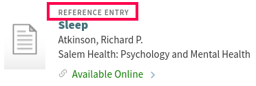
Students are often asked to look for particular types of resources for their assignments (e.g., scholarly articles, books), and yet the labels for format types do not stand out and are often overlooked. While some entries show an icon for a format type, icons are a tricky business that aren’t always intuitive to students.
Takeaway: Consider using CSS to modify the size of format labels.
- Chico State: Chico UX
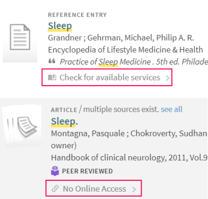
Ambiguity is a turn-off
Unhelpful availability statements confuse students and librarians (e.g., Unavailable, Check for available services, No online access, Check holdings, No full text available). If users can’t discern what action to take, they’ll start seeing those confusing cues as things to avoid.
Takeaway: Say what you mean, using clear labels. Make it as easy as possible for students to get to what they really need - ahem, the full text.
- Linfield College: Improving Primo usability and teachability with help from the users
Signing in is easy
Users appear to have no problems signing in to Primo, or navigating their Account area.
Takeaway: You may not need to spend much time improving this area of the interface.

- Washington State: Usability (LITA)
Push pin perplexity
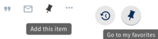
Who doesn’t love watching that push pin fly up to the favorites menu? And yet, some users do not understand the connection between “pinning” items and actually accessing them later on the “favorites” menu!
Takeaway: Clarify your labels, and make sure they are consistent. Change the tool tip of the push pin to say “add to my favorites” instead of “add this item.”
- Washington State: Usability (LITA)
Full record confusion
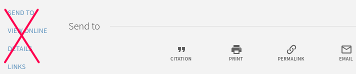
In the full record display, most students do not use the left toolbar appropriately, and are confused by this functionality.
Takeaway: Consider hiding the left toolbar using CSS
- Washington State: Usability (LITA)
Full text fatigue
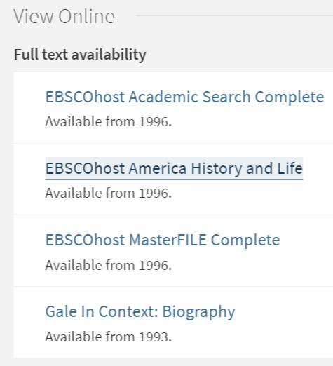
Which path leads to full text? We all pause when we see a long list of options that seem to present us with the same choice.
Takeaway: We need to get a handle on Discovery Interface Display Logic
- Orbis Cascade: DUX Reference and Instruction Survey Final Report